Combining Professional Forecasters with Copulas (Part 1): The Survey of Professional Forecasters
This is the first post in a three-part series. Part 1 introduces the Survey of Professional Forecasters and provides a thorough exploratory analysis of the dataset. Part 2 develops the copula framework and validates it on synthetic data. Part 3 runs the walk-forward empirical horserace on official SPF evaluation targets.
Why forecast combination matters
You have several forecasters. Each one issues quarterly predictions for an economic variable, say the unemployment rate two quarters from now. None of them is reliably the best. They agree with each other more than they disagree. How should you combine them into a single estimate that is better than any individual forecaster and, ideally, better than simply averaging all of them?
This question has occupied economists since Bates and Granger’s 1969 paper introduced the combination framework. It has a subtlety that is easy to miss: the naive answer (“optimally weight them”) often fails in practice. The optimal weights, estimated from data, carry enough estimation noise that a simple equal-weight average frequently beats them out-of-sample. This empirical regularity is called the forecast combination puzzle.
Over this three-part series we will use a copula-based combination method to probe when and why the puzzle appears and disappears. The dataset is the Survey of Professional Forecasters (SPF): 58 years of quarterly macroeconomic predictions, freely available from the Federal Reserve Bank of Philadelphia. This post is entirely about understanding that dataset before fitting any model.
The Survey of Professional Forecasters: a brief history
The SPF was launched in 1968, making it one of the oldest continuously-run macroeconomic forecast surveys in the world. It was originally co-sponsored by the American Statistical Association (ASA) and the National Bureau of Economic Research (NBER). In 1990, the Federal Reserve Bank of Philadelphia took over administration and has run the survey ever since without interruption.
The survey is conducted quarterly, near the middle of each quarter, before the Bureau of Economic Analysis releases its advance GDP estimate. Participants are professional economists at banks, investment firms, research institutions, and universities. Participation is voluntary and anonymous: each respondent is identified by a numeric ID that appears consistently across surveys but is never linked to a name or institution in the public data release.
Why central banks pay attention. The SPF is a primary external cross-check for the Federal Reserve’s own internal Greenbook projections. In the period before the Greenbook became public, the SPF was one of the few sources of professional near-term forecasts that the Fed could compare itself against. Today, the Fed’s Monetary Policy Report cites SPF long-run inflation expectations as a measure of inflation anchoring. The European Central Bank and the Bank of England run structurally similar surveys (the ECB SPF and the Bank of England’s Monetary Policy Committee surveys), partly inspired by the U.S. SPF.
Why the academic literature uses it. The combination of individual-level microdata, long history, and multiple variables makes the SPF unusually rich for econometric research. Key papers that use it include:
- Ang, Bekaert, and Wei (2007): showed that the SPF consensus outperforms a wide range of model-based inflation forecasts, including Phillips-curve, term-structure, and time-series models.
- Coibion and Gorodnichenko (2015): used the individual-level microdata to document information rigidity, i.e., professional forecasters underreact to publicly available data in a way consistent with sticky information models.
- Genre, Kenny, Meyler, and Timmermann (2013): studied whether any combination method beats the simple average for same-horizon SPF forecasts and found the puzzle alive and well.
The dataset: variables, horizons, and structure
The SPF collects predictions for a set of U.S. macroeconomic variables at five horizons each quarter: the nowcast (the current quarter, which may be partially observed), and four-quarters-ahead. The eight variables used in this series are described below.
Real GDP growth (RGDP)
What it measures. Real Gross Domestic Product is the total market value of all goods and services produced in the United States in a given quarter, adjusted for inflation using chain-weighted price indices with a base year of 2017. It is the broadest single measure of economic activity.
How it is collected. The Bureau of Economic Analysis (BEA) releases three successive vintages each quarter: the advance estimate (about four weeks after quarter-end), the second estimate (about eight weeks), and the third estimate (about twelve weeks). SPF forecasters submit responses near the middle of the quarter, so the advance estimate for the just-completed quarter is not yet available; forecasters are largely working from monthly indicators (employment, retail sales, industrial production).
Units in SPF. Forecasters report in billions of chained 2017 dollars at a seasonally adjusted annual rate. We convert to quarter-on-quarter growth rates (%) using the ratio of consecutive horizon values from the same respondent’s row.
Why it matters. Real GDP growth is the headline indicator for business cycle expansions and recessions, the variable the Federal Open Market Committee implicitly or explicitly targets through the dual mandate, and the reference series for most macroeconomic models. Predicting it correctly is notoriously difficult: GDP growth is close to a random walk over quarterly horizons once trend growth is removed.
GDP price deflator (PGDP)
What it measures. The GDP price deflator (also called the GDP implicit price deflator) is the ratio of nominal GDP to real GDP; it covers the prices of all goods and services included in GDP, including investment, government spending, and net exports. It is therefore broader than the CPI, which covers only household consumption.
How it is collected. Published by the BEA alongside GDP releases. Subject to the same vintage structure as RGDP.
Units in SPF. Forecasters report index levels (2017 = 100). We convert to quarter-on-quarter growth rates.
Why it matters. The GDP deflator is the broadest measure of domestic price pressure. The Federal Reserve’s preferred inflation gauge is the PCE deflator (Personal Consumption Expenditures), which is closely related but covers a slightly different basket. Academic forecasting studies often use PGDP because its history in the SPF is longer than the PCE series.
Nominal GDP (NGDP)
What it measures. Nominal GDP is GDP measured at current market prices, without any inflation adjustment. By accounting identity, NGDP growth equals real GDP growth plus the GDP deflator inflation rate. It is therefore the sum of the two previous variables.
Units in SPF. Billions of current (nominal) dollars at a seasonally adjusted annual rate, converted to quarter-on-quarter growth rates.
Why it matters. Nominal GDP targeting was proposed as an alternative monetary policy framework (McCallum 1987, Sumner 2014): the idea is that a central bank targeting a stable NGDP growth path would automatically accommodate supply shocks without generating unnecessary recessions. The variable thus has a direct policy relevance beyond its role as a bookkeeping identity.
Industrial production (INDPROD)
What it measures. The Federal Reserve’s Industrial Production index tracks the real output of the manufacturing, mining, and electric and gas utilities sectors. It covers roughly one fifth of the U.S. economy but is more cyclically sensitive than GDP because it excludes the service sector, which is less volatile.
How it is collected. Produced by the Federal Reserve Board and released monthly, giving forecasters more within-quarter information than for GDP.
Units in SPF. Index levels (2017 = 100), converted to quarter-on-quarter growth rates.
Why it matters. Because industrial production is available monthly, it serves as a key input to GDP nowcasting models. The Chicago Fed National Activity Index and the Philadelphia Fed’s ADS index both weight industrial production heavily. Its higher frequency makes it more predictable at short horizons from within-quarter data, but it is more volatile than GDP at longer horizons.
Housing starts (HOUSING)
What it measures. Housing starts counts the number of new privately owned residential units on which construction has begun in a given month. The SPF variable is a quarterly aggregate.
How it is collected. Published monthly by the U.S. Census Bureau and the Department of Housing and Urban Development, available with only a short lag.
Units in SPF. Thousands of units at a seasonally adjusted annual rate, converted to quarter-on-quarter growth rates.
Why it matters. Housing starts is one of the most reliable leading indicators of the business cycle: residential investment typically peaks well before recessions and troughs early in recoveries. The series is highly sensitive to mortgage rates, which means it reflects Federal Reserve policy with a lag of six to eighteen months. As a result it is watched closely by financial market participants. However, it is also highly volatile and subject to weather effects, making medium-term forecasting particularly hard.
Corporate profits (CPROF)
What it measures. The BEA’s after-tax corporate profits series measures the operating surplus earned by domestic corporations, adjusted for inventory valuation and capital consumption. It is a quarterly flow variable.
How it is collected. Published by the BEA as part of the National Income and Product Accounts (NIPA), with substantial revision risk: the data is subject to benchmark revisions that can be large and retrospective.
Units in SPF. Billions of current dollars, converted to quarter-on-quarter growth rates.
Why it matters. Corporate profits are a leading indicator of future investment and hiring decisions: firms that earn more tend to invest more. They are also directly relevant to equity valuation (equity prices are discounted future profits), and they are an important input to fiscal projections because corporate tax revenues track profits with a short lag. Despite their economic importance, corporate profits are one of the hardest SPF variables to forecast, partly because of their volatility and partly because of data revision uncertainty.
Unemployment rate (UNEMP)
What it measures. The unemployment rate is the share of the civilian labour force that is without a job, actively seeking work, and available to work. It is the most widely followed labour market indicator.
How it is collected. The Bureau of Labor Statistics (BLS) computes the rate from the monthly Current Population Survey (CPS), a household survey of approximately 60,000 households. It is released on the first Friday of the following month and is not subject to large revisions (unlike GDP).
Units in SPF. Percentage of the labour force, reported directly as a level (not a growth rate). This is important: because unemployment is a rate, it is already stationary and mean-reverting, and forecasters submit it as a level rather than a change.
Why it matters. Unemployment is one of the two variables in the Federal Reserve’s dual mandate (maximum employment and price stability). It is also a key input to wage dynamics and therefore to inflation (the Phillips curve links unemployment gaps to inflation). Its serial persistence is extremely high: the first-order autocorrelation of quarterly unemployment is above 0.97 over the full SPF sample. This means that even a naive “next quarter will look like this quarter” forecast achieves Spearman rank correlation above 0.95 with the realised outcome, a benchmark that combination methods must beat.
CPI inflation (CPI)
What it measures. The Consumer Price Index for All Urban Consumers (CPI-U) measures the average change over time in the prices paid by urban consumers for a representative basket of goods and services. The basket includes food, energy, housing, medical care, transportation, and recreation, weighted by expenditure shares from the Consumer Expenditure Survey.
How it is collected. Each month, BLS field agents physically record prices for roughly 80,000 items across approximately 23,000 retail outlets, service providers, and rental units (grocery stores, hospitals, landlords, gas stations, etc.) in 75 urban areas. Items are organised into a fixed consumption basket whose weights come from the Consumer Expenditure Survey, which tracks what households actually spend. Housing costs, the single largest component, are measured via owners’ equivalent rent, estimated by surveying renters about what their units would fetch on the open market. The BLS releases the resulting index monthly, typically in the second or third week of the following month. Unlike GDP, CPI is not subject to major revisions after initial release; only seasonal adjustment factors are updated annually, and those changes are modest.
Units in SPF. The SPF asks for the percentage change in the CPI over the relevant forecast horizon, expressed at an annual rate. This is one of the rate variables reported directly rather than as a level.
Why it matters. CPI is the most visible inflation measure for households, wage negotiators, and indexed contracts (Social Security benefits, TIPS coupons, many labour agreements are CPI-indexed). The Fed targets a 2% rate of PCE inflation, which historically runs about 0.3-0.5 percentage points below CPI, but the public and markets watch CPI closely. The unpredictability of CPI beyond very short horizons (the nowcast captures quarter-to-quarter momentum, but by h=2 the correlation with realised values drops to around 0.32 for the consensus and near zero for individual forecasters) reflects genuine macroeconomic uncertainty: inflation depends on energy prices, supply chains, and expectations, none of which are easily projected two quarters out.
A compact summary:
| Code | What is forecasted | Units | Level or rate |
|---|---|---|---|
| RGDP | Real GDP | q/q growth % | Level → growth |
| PGDP | GDP price deflator | q/q growth % | Level → growth |
| NGDP | Nominal GDP | q/q growth % | Level → growth |
| INDPROD | Industrial production index | q/q growth % | Level → growth |
| HOUSING | Housing starts | q/q growth % | Level → growth |
| CPROF | Corporate profits | q/q growth % | Level → growth |
| UNEMP | Unemployment rate | % of labour force | Rate (direct) |
| CPI | CPI-U inflation | % annual rate | Rate (direct) |
Level variables are reported by forecasters as quarterly index levels; we convert to quarter-on-quarter growth rates using the ratio of consecutive horizon columns. Rate variables are reported directly as percentages and require no transformation.
The full microdata file is publicly available at no charge from the Philadelphia Fed:
import pandas as pd

# Download once from Philadelphia Fed:
# https://www.philadelphiafed.org/surveys-and-data/real-time-data-research/individual-forecasts
# Then read with calamine engine (openpyxl fails on this file's date types)

xl = pd.ExcelFile("spfmicrodata.xlsx", engine="calamine")
print(xl.sheet_names)
# ['NGDP', 'PGDP', 'CPROF', 'UNEMP', 'EMP', 'INDPROD', 'HOUSING',
#  'TBILL', 'BOND', 'BAABOND', 'TBOND', 'RGDP']
Each sheet has the structure:
YEAR  QUARTER  ID   RGDP1  RGDP2  RGDP3  RGDP4  RGDP5  RGDP6  ...
1968  4        1    713.9  720.1  730.2  ...
1968  4        2    713.9  735.0  748.0  ...
The column convention is: {VAR}1 is the previous quarter’s level (provided as a common anchor), {VAR}2 is the nowcast (h=0), {VAR}3 is h=1, through {VAR}6 which is h=4.
Building realised values. We reconstruct realised outcomes from the survey data itself: for target quarter $t$, the realised value is the median of the panel’s h=0 (nowcast) column in the survey for quarter $t+1$. By the time the next survey is conducted, the BEA advance estimate is already public, so the following quarter’s nowcast is effectively a read on the just-completed quarter. This is a standard real-time proxy used in the forecast evaluation literature (Croushore and Stark 2001). It is important to acknowledge that this is not the same as the final revised BEA estimate and may differ materially for periods with large revisions, notably around recessions and 2020-2021.
def qadd(y, q, k):
    """Advance (y, q) by k quarters."""
    idx = y * 4 + (q - 1) + k
    return idx // 4, idx % 4 + 1

# For a level variable like RGDP:
# realised growth for quarter t = median(RGDP2) in survey t+1
# where RGDP2 is the h=0 (nowcast) column
actuals = {}
for (y, q), grp in df.groupby(["YEAR", "QUARTER"]):
    median_nowcast = grp["RGDP2"].median()
    if pd.notna(median_nowcast):
        ty, tq = qadd(y, q, -1)        # this nowcast refers to the prior quarter
        actuals[(ty, tq)] = median_nowcast

# Convert levels to growth rates
realized_growth = {}
for (y, q), level in sorted(actuals.items()):
    ty, tq = qadd(y, q, -1)
    if (ty, tq) in actuals:
        realized_growth[(y, q)] = level / actuals[(ty, tq)] - 1
EDA 1: panel size and forecaster turnover
The first thing to understand about the SPF is how the panel has evolved over 58 years.
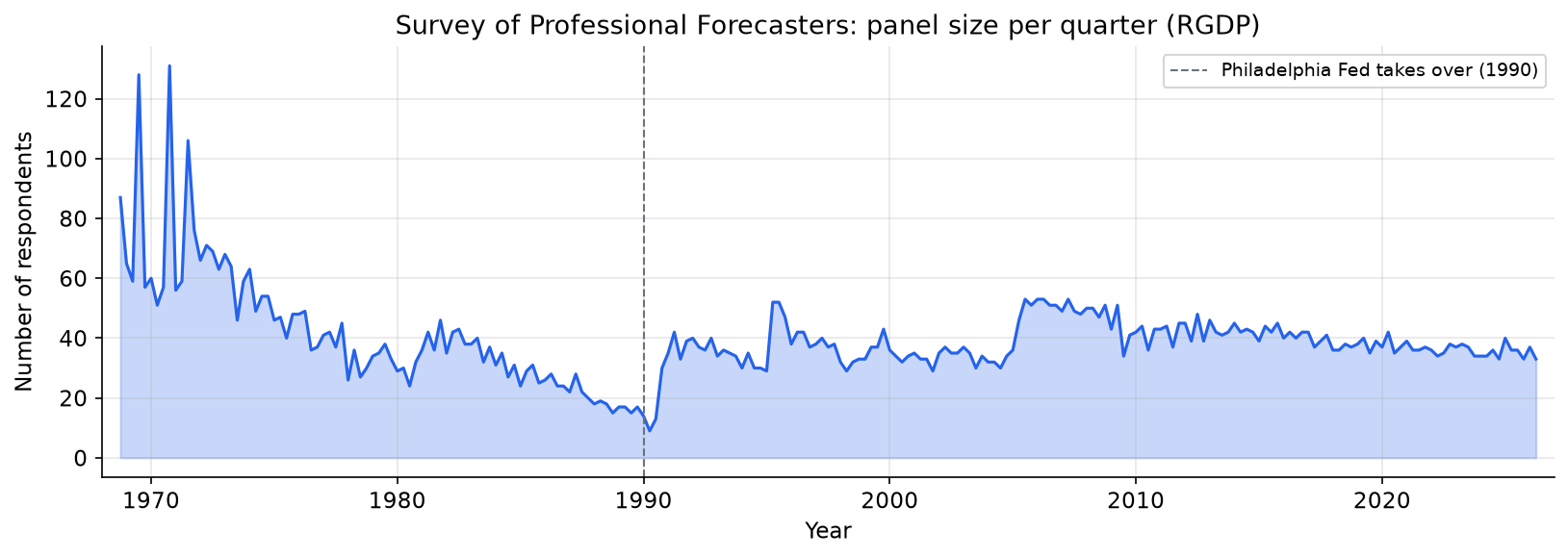
The panel grew rapidly in the 1970s, contracted in the late 1980s, then stabilised after the Philadelphia Fed took over administration in 1990. Since 1990, the RGDP panel has consistently attracted 30-50 respondents per quarter, with a brief contraction during the 2008-2009 financial crisis and a more sustained one after 2020 as some long-tenured participants retired.
The turnover problem. Of the 463 unique forecaster IDs in the RGDP file, most are active for a short stretch:
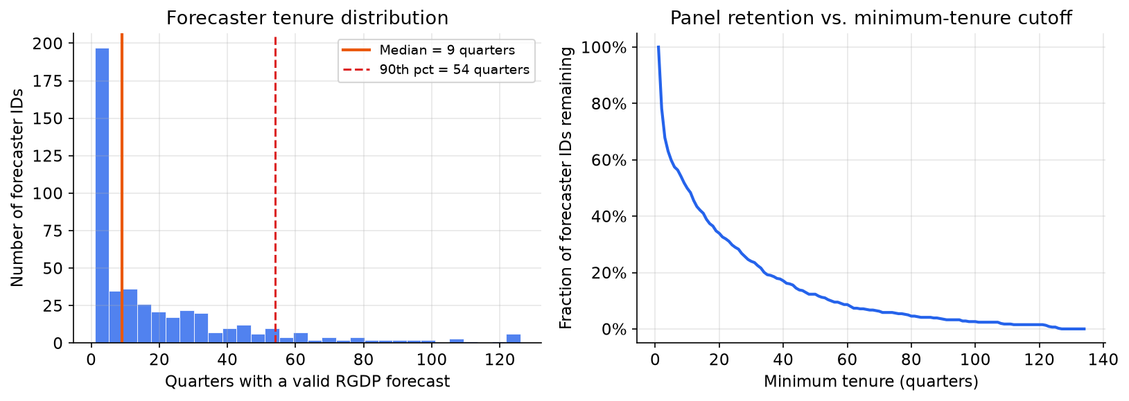
The median forecaster submits RGDP predictions for only about 9 quarters. The 90th percentile is around 54 quarters (13.5 years). Even the most persistent forecaster in the RGDP panel appears in only 126 of 231 surveys (54%). This has an important modelling consequence: a balanced panel of named forecasters spanning the full 58-year history is not feasible. We address this in two ways in the later posts: by using the panel consensus (median) across all active respondents at each horizon, and by running a named-forecaster experiment restricted to the sub-period where at least three of the most persistent respondents are simultaneously active.
import numpy as np

# Load RGDP sheet
df = pd.read_excel(xl, sheet_name="RGDP", engine="calamine")

# Count quarters per forecaster
tenure = df.groupby("ID")["YEAR"].count()

print(f"Unique IDs: {df['ID'].nunique()}")
print(f"Median tenure (quarters): {tenure.median():.0f}")
print(f"90th percentile: {tenure.quantile(0.9):.0f}")
print(f"Max (most persistent): {tenure.max()}")
print(f"Fraction of total 231 quarters: {tenure.max() / 231:.1%}")
# Unique IDs: 463
# Median tenure (quarters): 9
# 90th percentile: 54
# Max (most persistent): 126
# Fraction of total 231 quarters: 54.5%
EDA 2: how predictable are these variables?
Before thinking about combination, the most basic question is whether professional forecasters have any skill at all, and how that skill varies across variables and horizons.
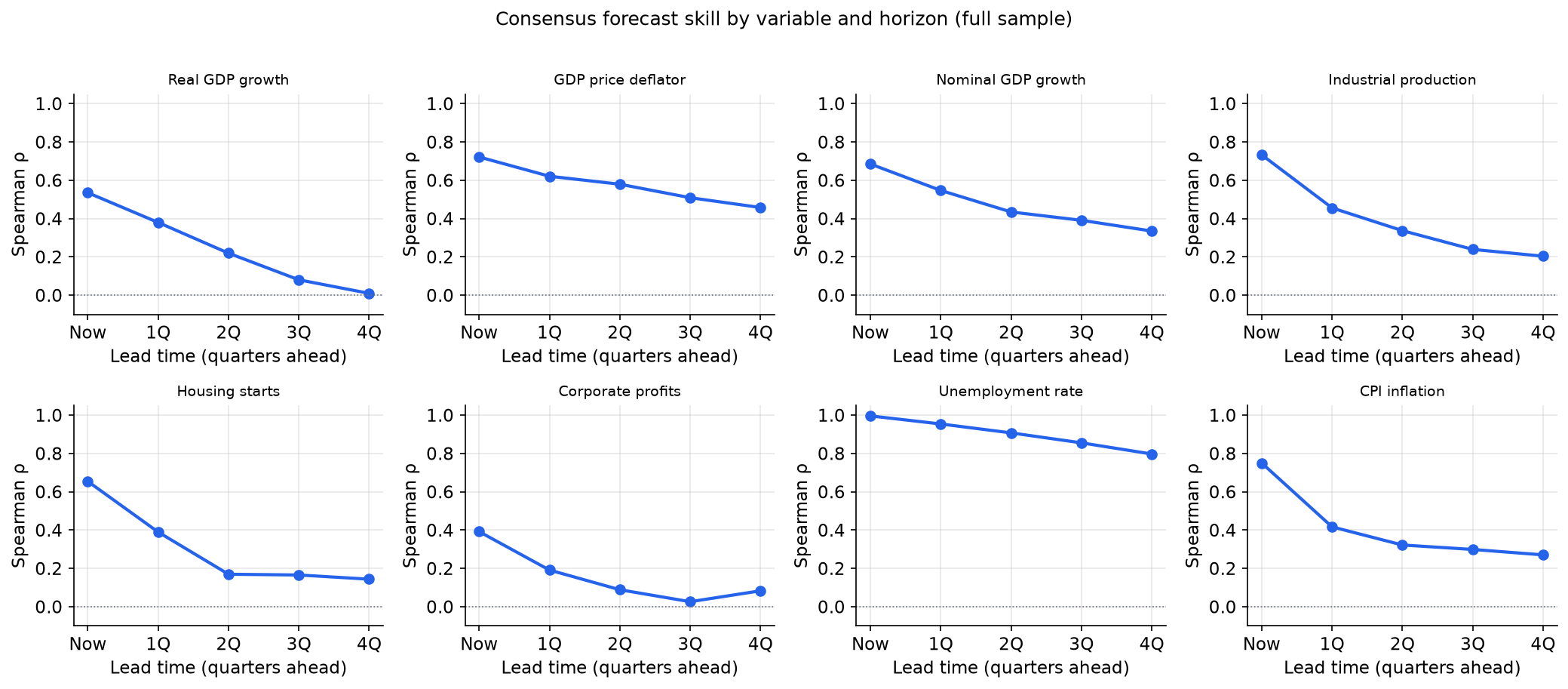
The pattern is striking and variable-specific:
-
Unemployment rate is the most forecastable variable at every horizon. Even four quarters ahead, the consensus has a Spearman rank correlation with the realised rate above 0.30. The nowcast correlation exceeds 0.99. This reflects the strong serial persistence of unemployment: the level this quarter predicts next quarter’s level with very high accuracy.
-
CPI inflation forecast skill decays quickly. The nowcast correlation is around 0.60 (the BLS releases CPI for the first month of the quarter before the survey date, giving forecasters a partial read on current-quarter inflation), but by h=2 the consensus correlation drops to around 0.32, and individual forecaster skill is near zero. The consensus still extracts a weak common signal, but individual precision is essentially gone.
-
Real GDP growth is difficult to forecast even one quarter ahead. The nowcast correlation (around 0.55) reflects the within-quarter monthly indicators already available at survey time (payrolls, retail sales, industrial production) rather than the BEA advance GDP estimate, which is not yet published when forecasters submit; the one-quarter-ahead forecast already struggles to beat persistence.
The fact that predictability varies so much across variables is important for the combination design: any method that pools across variables must account for this heterogeneity.
from scipy.stats import spearmanr

def consensus_skill_by_horizon(var, panel_df, realized_df):
    """Compute Spearman ρ between consensus forecast and realised, for each horizon."""
    rhos = []
    for h in range(5):
        col = f"{var}{h + 2}"   # h=0 -> col 2, h=4 -> col 6
        if col not in panel_df.columns:
            rhos.append(np.nan); continue
        # Panel consensus = median across all respondents in each survey quarter
        consensus = panel_df.groupby(["YEAR", "QUARTER"])[col].median().reset_index()
        # Advance survey date to the target quarter
        consensus["target_y"] = consensus.apply(
            lambda r: qadd(int(r.YEAR), int(r.QUARTER), h)[0], axis=1)
        consensus["target_q"] = consensus.apply(
            lambda r: qadd(int(r.YEAR), int(r.QUARTER), h)[1], axis=1)
        merged = consensus.merge(realized_df, on=["target_y", "target_q"]).dropna()
        rhos.append(spearmanr(merged[col], merged["realized"]).statistic
                    if len(merged) >= 20 else np.nan)
    return rhos
EDA 3: individual forecaster skill and its distribution
The consensus masks a wide distribution of individual skill. How different are the best and worst forecasters in the panel?
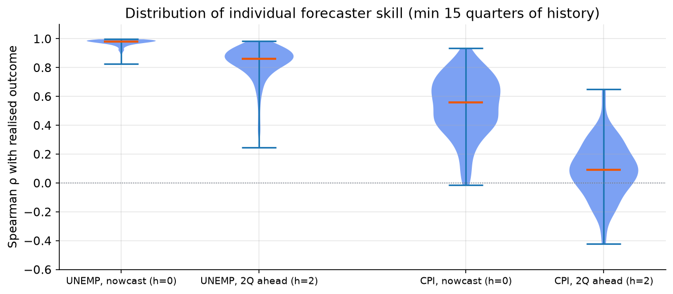
The two extremes of the dataset are illustrated clearly:
-
UNEMP at h=0 (nowcast): almost every individual forecaster has a Spearman correlation above 0.90 with the realised rate. The median is 0.98. There is essentially no skill heterogeneity: anyone who submits a reasonable nowcast for unemployment gets the ranking right almost perfectly. Averaging these forecasters is trivially close to optimal.
-
CPI at h=2: the distribution of individual correlations is centred close to zero, with a wide spread. Some forecasters have positive correlation, some have negative correlation. The median is around 0.09. This is the canonical “hard to forecast” regime: even the best-performing panelists are barely better than noise, and combining noise does not produce signal.
The intermediate cases (UNEMP h=2 and CPI h=0) are where the combination question is most interesting.
def individual_rhos(var, horizon, panel_df, realized_df, min_quarters=15):
    """Distribution of per-forecaster Spearman ρ with the realised outcome."""
    col = f"{var}{horizon + 2}"
    rows = []
    for _, row in panel_df.iterrows():
        sy, sq = int(row["YEAR"]), int(row["QUARTER"])
        ty, tq = qadd(sy, sq, horizon)
        if pd.notna(row[col]):
            rows.append({"target_y": ty, "target_q": tq,
                         "ID": int(row["ID"]), "forecast": row[col]})
    df_fc = pd.DataFrame(rows).merge(realized_df, on=["target_y", "target_q"])
    rhos = []
    for iid, grp in df_fc.groupby("ID"):
        if len(grp) >= min_quarters:
            rhos.append(spearmanr(grp["forecast"], grp["realized"]).statistic)
    return rhos
EDA 4: is individual skill persistent?
If some forecasters are systematically better than others, a combination method that upweights them should outperform equal-weighting. But is there persistent skill?
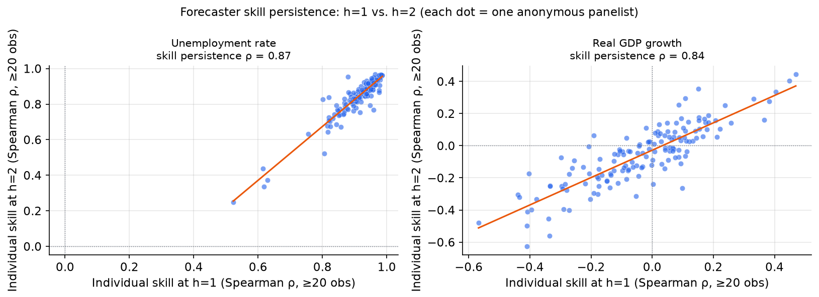
For unemployment, skill is strikingly persistent: a forecaster who performs well at h=1 also performs well at h=2. The Spearman correlation between a forecaster’s skill rank at h=1 and their skill rank at h=2 is very high. This makes intuitive sense: forecasters who understand the persistence structure of unemployment do well at all horizons.
For real GDP growth, the picture looks superficially similar (skill persistence ρ = 0.84, nearly as high as unemployment’s 0.87), but the distribution of skill is fundamentally different: many RGDP forecasters have near-zero or negative Spearman correlations with the realised outcome at both horizons, so the panel is centred near zero rather than near one. What the persistence coefficient tells us is that whatever skill or bias a forecaster has, it is durable across horizons; it does not tell us that skill levels are high. This aligns with the broader finding in the forecasting literature that RGDP growth is close to a martingale over quarterly intervals: most forecasters have little genuine skill, and those who do are consistently skilled, while those with systematic biases remain biased.
The existence of persistent skill for unemployment suggests that combination methods which exploit skill differentials could add value, at least in principle. Whether they do in practice depends on how reliably those differentials can be estimated from finite data.
EDA 5: the cross-horizon redundancy structure
When we combine forecasts at different lead times (e.g., the nowcast alongside 1-, 2-, 3-, and 4-quarter-ahead consensus forecasts), the signals are not independent. How correlated are they?
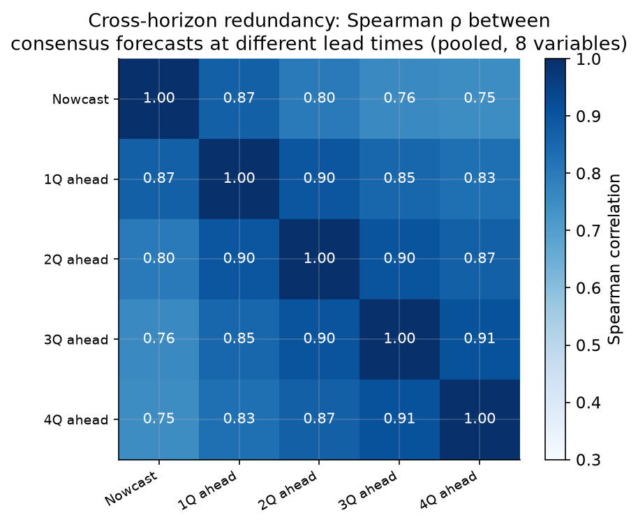
The correlation between consecutive horizons is very high: the nowcast and 1-quarter-ahead consensus correlate at 0.87; the 3Q and 4Q-ahead forecasts correlate at 0.91. Even the least-correlated pair, nowcast and 4Q-ahead, has a Spearman correlation of 0.75. This redundancy structure has a direct implication for combination: a simple average of the five lead-time forecasts dilutes the most informative one (the nowcast) with four highly redundant, less accurate versions. An optimal method should recognise this and concentrate weight on the most informative signal.
The redundancy is not accidental. Forecasters form their views about the current quarter first, then extrapolate to future quarters using a model that is largely anchored to the current forecast. A forecaster’s 4Q-ahead view of GDP growth is typically little more than their nowcast adjusted for mean reversion.
# Compute cross-horizon Spearman correlation matrix (pooled across all 8 variables)
# Using the prebuilt panel wide format: one row per (var, target_y, target_q)
df_wide = pd.read_parquet("spf_panel_wide.parquet").reset_index()
lead_cols = ["lead0", "lead1", "lead2", "lead3", "lead4"]
corr_matrix = df_wide[lead_cols].dropna().corr(method="spearman")
print(corr_matrix.round(2))
#         lead0  lead1  lead2  lead3  lead4
# lead0    1.00   0.87   0.80   0.76   0.75
# lead1    0.87   1.00   0.90   0.85   0.83
# lead2    0.80   0.90   1.00   0.90   0.87
# lead3    0.76   0.85   0.90   1.00   0.91
# lead4    0.75   0.83   0.87   0.91   1.00
EDA 6: how predictable is each variable at h=2?
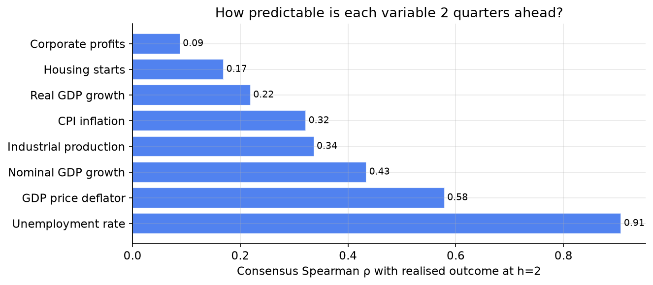
The gap between the most and least predictable variables at a two-quarter horizon is enormous. Unemployment (consensus Spearman correlation 0.91 with realised) is roughly three times more predictable than CPI (0.32) and ten times more predictable than corporate profits (0.09), which is the least forecastable variable in the panel. This heterogeneity means that any pooled analysis across variables must be interpreted carefully: pooling improves statistical efficiency but conflates very different underlying environments.
EDA 7: realised values and regime shifts
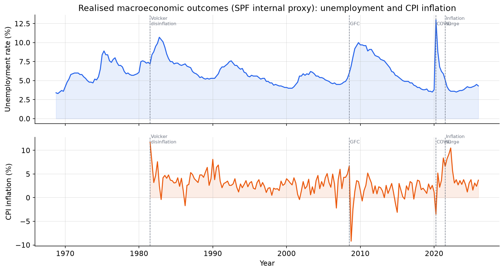
The 58-year sample covers six distinct macroeconomic regimes:
- 1968-1979 (Great Inflation): unemployment rises and CPI climbs to double digits.
- 1980-1983 (Volcker disinflation): deliberate tight monetary policy drives CPI from 13% to 3% at the cost of a deep recession and peak unemployment of 10.8%.
- 1984-2007 (Great Moderation): low volatility in both inflation and output growth, long expansions.
- 2008-2009 (Global Financial Crisis): unemployment spikes from 4.4% to 10%.
- 2010-2019 (post-GFC recovery): slow recovery, below-target inflation throughout.
- 2020-2026 (COVID and aftermath): unemployment briefly hit 14.7% in April 2020, then fell sharply; CPI surged to 9% in 2022, the highest in 40 years, before gradually retreating.
This regime diversity is important for evaluating any combination method out-of-sample: a model trained on Great Moderation data may perform very differently during the inflation surge of 2021-2022. We will trace this explicitly in Part 3.
EDA 8: forecaster disagreement over time
Do professional forecasters agree more or less during economic stress?
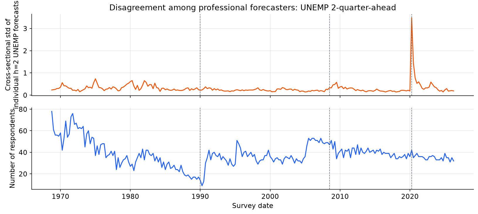
Disagreement (cross-sectional standard deviation of 2Q-ahead UNEMP forecasts) was low and stable for most of the survey’s history, including during the Great Inflation and the Volcker recession. It shows a small visible spike at the Global Financial Crisis and then an enormous spike at COVID, by far the largest in the 58-year sample. The COVID spike is consistent with the unprecedented uncertainty about the trajectory of the labour market: no historical analogue existed for a pandemic-induced shutdown followed by an equally sharp reopening. The absence of elevated disagreement during the 1970s-1980s recessions is itself informative: unemployment is persistent enough that even during those turbulent episodes, forecasters converged on similar near-term paths.
This pattern has a direct implication for combination: during periods of high disagreement, the cross-sectional distribution of forecasts carries more information (some forecasters may have genuinely different information sets or models), making it potentially more valuable to weight them unequally. During periods of low disagreement, equal-weight is nearly optimal by symmetry.
What the EDA tells us
Before fitting any model, the data already answers several questions:
1. The combination problem is not trivial. Individual forecasters vary enormously in skill, depending on the variable and horizon. UNEMP nowcasters are essentially all equally skilled; CPI medium-term forecasters are all essentially noise. The interesting combination problem lives in the middle: variables and horizons where some skill exists, some heterogeneity exists, and some redundancy across signals must be managed.
2. The cross-horizon structure is the main design lever. The five lead-time forecasts of the same variable are a natural set of signals: they are all targeting the same outcome, they have a structural skill hierarchy (nowcast is always best), and they are highly correlated with each other. This creates the exact redundancy that a well-designed combination method should exploit.
3. Panel turnover limits named-forecaster experiments. The 58-year span is too long for a balanced panel of named forecasters. Any long-run analysis must use the consensus. For experiments on the combination puzzle (same-horizon, named-forecaster combinations), we are limited to smaller panels where a few high-coverage individual forecasters overlap for the same variable, horizon, and target quarter.
4. Regime diversity is substantial. A combination method that works during the Great Moderation may fail during an inflation surge. Part 3 checks whether the main rankings remain stable through time using rolling out-of-sample performance summaries.
What comes next
Part 2 builds the mathematical framework. We separate two approaches: modelling the joint dependence of outcomes and forecasts, and modelling the joint dependence of forecast errors. The Gaussian outcome-forecast copula reduces to OLS / best linear prediction on probit ranks; the Gaussian error model gives the more classical GLS-style precision-weighted combination. We also introduce vine copulas for both approaches and use synthetic data to show when their extra flexibility helps.
Part 3 puts the resulting method families on the SPF data: simple baselines (persistence, Lead 0, equal-weight, trimmed mean, inverse MSE), outcome-forecast methods (OLS/rank regression, Gaussian copula, vine copula), and error-dependence methods (error GLS, shrinkage variants, and error-copula diagnostics). It reports the walk-forward horserace, revision-sensitivity checks, rolling out-of-sample performance, and named-forecaster case studies.
Data: SPF Individual Forecasts, Federal Reserve Bank of Philadelphia.